10 Easy Tips for Designing Great Event Websites

Websites are still one of the most powerful marketing tools for events today. They provide people with information. They educate. They entertain. Ultimately, they get people to sign up to your event. But if your website has too much information, doesn’t look appealing and more importantly, doesn’t create a sense of excitement around your event, then chances are people are going to go elsewhere.
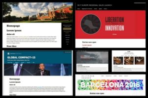
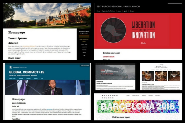
Thanks to recent advancements in technology, you no longer need to be an expert in web design to put together a great looking site for your event. Most event management solutions these days offer web design tools that have an abundant choice of templates that make the whole process a whole lot easier. But speed and convenience isn’t everything. People make conclusions about an event very quickly through its website and it’s important to make a good impression from the start.
We had a chat with web designer, Dan Auty, who has worked on event websites for companies like Peugeot, BP and The Law Society, to discuss some of the latest trends in web design and look at some of the key things organisations need to think about when building websites for their events:
 1) Get to the Point!
No one really looks at a web page for more than 10 seconds, so focus on your event’s key message. Make sure that anyone coming to the landing page of your site can quickly scan it, understand what the event is about, find out when and where it’s happening and how they can register. Stick to one paragraph and avoid long-winded introductions – chances are people are not going to read it, especially if they already have an idea about your event through the invitation link that led them to the site in the first place. Make sure that the date, location and your CTA button (ex. ‘Register Now’), are positioned above the fold and that they’re available on each page of your site. If you make it difficult for visitors to find this information, they will leave.
2) Showcase Your Main Selling Points
Make sure your landing page has something that grabs the visitor’s attention. You can feature a well-known guest speaker or even testimonials from celebrities or high-profile attendees that came to your last event. If your venue is in an attractive location like Las Vegas or the Caribbean, then use large colourful location shots that get people excited about the experience they’ll have around the event. Las Vegas at night is an attractive image to a lot of people, regardless of what the event is about.
 3) Use Strong Visuals

Over the last few years, websites are putting a lot more emphasis on the use of visuals like images, graphics and videos. Think about the visual draw of your event that isn’t necessarily the subject matter. You can use pictures of your event location or venue – exterior and interior shots of fancy or well-known facilities usually work well. Or you can use images of your guest speakers or the cocktail party you had at your last event.
What you want to avoid is pictures of people speaking at podiums or attendees sitting in dingy seminar rooms. Also, try to avoid using generic stock photos of people having meetings in boardrooms etc. – instead, use real images from your previous events. And if you can’t find the right photo, try using illustrations in your visual mix. You can easily say a lot through a well-designed graphic.
4) Video is a Big Deal
Video content marketing has been gaining a lot of momentum over the last few years. In fact, a recent industry poll from Eventsforce revealed that 84% of event planners are using video as part of their marketing efforts to promote their events. Videos gives attendees the opportunity to learn more about your event and they do a good job of conveying the personality of your organisation. They also are a lot more engaging than text – Forrester Research claims that a minute of video can be equivalent to 1.8 million words!
Videos that automatically play in the background can add a lot to a page but try and limit the ones that play with sound as it can be off-putting for some visitors. There are many other ways of using videos on your event website – from save-the-date-videos and highlights from your last event to video testimonials, interviews with keynote speakers and informal blog-style videos that can feature tours of your venue. Have a look at this article here for more ideas on using video on your event websites.
 5) Don’t Forget About Fonts

Many event websites use a particular font or typography that follow the organiser’s corporate guidelines but there are also many out there that choose their own. If you have that choice, then make sure you have think about it carefully as the typography you decide on can indicate subtle hints about the personality of your event or organisation. Is it a fun event or a serious one? Is it educational or inspirational?
Web designers used to be limited to certain font types to ensure that it would be supported by common browsers and devices, but this is no longer the case. There is a large selection of fonts you can choose from – though if you’re stuck, ‘Arial’ is still a popular one as it look good on all types of screens. You can also look at Google’s range of fonts here, which are all free to use.
6) Colour Schemes
Research from QuickSprout shows that 90% of all product assessments have to do with color. In fact, colour is 85% of the reason you purchase a specific product. So, it’s a no-brainer for any website that colour affects conversions. But colour can be a tricky thing – you have to use it in the right way, at the right time with the right audience.
Again, you may be constrained by your organisation’s branding guidelines but as a general rule, stick to dark coloured text on light backgrounds. It looks good, gets better engagement and helps in conversions. It also has the added advantage for those site visitors with visual impairments. Sites with low contrast are difficult on the eye for most people but can be especially difficult for people with low vision – bad combinations include blue links on black backgrounds or red text on green. There is no hard and fast rule as to how much contrast is enough, but it usually isn’t too hard to figure out when certain colour combinations don’t contrast well together.
 7) Make Site Navigation Easy

Think about the user journey and try and make the path from one page to the next as smooth as possible. Avoid using a lot of drop down menus as they tend to look messy and can take up valuable space on your site. A lot of people will be looking at your site through mobile devices, so you need to think about how it’s going to look and work on different screens. Recent research by Tech Crunch, for example, shows that there is a new trend in using top bar menus for mobile instead of the traditional hamburger menu layouts.
Learn from your past events. Have a look at how visitors previously engaged with your event websites using Google Analytics – it can show you the exact journey visitors took throughout the site, as well as give you some valuable insight on popular pages, conversion rates and the point at which people were abandoning their registrations for your event. It’s also worth testing the navigation of your site by someone who hasn’t been involved in building it to get an objective view on content, functionality and how easy it is to use.
8) Registration Needs to be Simple
The overall look and feel of your registration pages may depend on the kind of registration software you are using for your events. As a general rule, however, try and make your forms as clean and simple as possible. Don’t have too many boxes and don’t ask unnecessary questions. For example, don’t ask attendees for their mailing addresses if you’re not going to end up using that information. Don’t forget, the more clicks it takes to close a sale, the more excuse your attendees have to walk away.
9) Make it Mobile Responsive
Most event websites today are mobile responsive and if they’re not, they should be. As well as giving your attendees a consistent user experience regardless of what device they view your site on, a responsive web design also helps with SEO. Google favours mobile-optimised sites and as a result, ranks these sites higher in search results. In fact, Google now penalises those sites that are not responsive – so all the valuable SEO your site currently has could all go to waste if it’s not viewable on a mobile device.
If your site is mobile responsive, then it’s easy to have two different websites for your desktop and mobile devices. The layout of your screen (including text and images) can change automatically based on the detected screen size of the user’s device. So if the browser detects a screen smaller than 480 pixels, for example, it will show the Smartphone layout of your site, which doesn’t include the Twitter feed you have on the desktop version. Having the flexibility to drop things in and out depending on the screen size ensures that people are getting the right kind of information as quickly as possible, regardless of the devices they use.
 10) Have Multilingual Support

Multilingual websites are actually one of the most cost-effective ways of marketing your events. They help attract new attendees, build closer relationships and give your events an international outlook. We’ve seen a number of conferences doing this over the last couple of years for – it helps them stay ahead of the competition. It also helps with SEO.
It doesn’t need to be a complicated process either. Most event management or registration software these days offer a multilingual module, which allows important pages on your event website including those for registration and agendas to be displayed in several popular world languages of your choice. For more information on the topic, have a quick read of this article here.
Want your event website to make an impact? Eventsforce can help you create branded mobile-responsive event websites in minutes using its simple content editing interface. Find out more by getting in touch here.